Glassmorphism: Peeking Through the Layers
That glassy UI you're seeing everywhere? It's actually an older design idea related to Skeuomorphism, and it's totally having a moment. Let's explore the resurgence of this design trend!


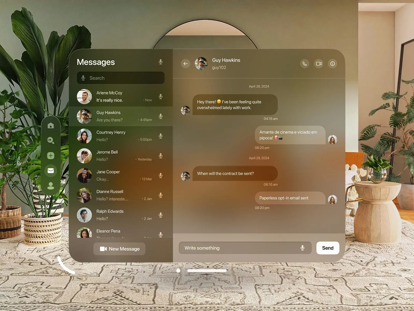
That cool, see-through trend popping up in UIs lately? Not exactly fresh out of the oven. Think of it as Skeuomorphism's cooler, more understated cousin, who spent a few years finding himself, only to return more refined and better looking with maturity. Let's dive into what makes this translucent trend resonate and how to recreate it’s slick aesthetic in your projects.
The Ghost of UI Past
While "Glassmorphism" is the buzzword du jour, the core concept of transparency in UI has been simmering for a while via Skeuomorphism. Remember software in the early 2000s? Back when buttons and icons had that distinct, tactile 3D feel, mimicking real-world materials? Glossy, almost lickable UI candy was king! Think Aqua UI on early Macs. In fact, Steve Jobs himself famously obsessed over making those elements feel almost tangible. He famously said:
"When you design a new user interface, you have to start off humbly. You have to start off saying 'What are the simplest elements in it? What does a button look like?' And you spend months working on that button… one of the design goals were if you saw it you’d want to lick it."
Fast forward to 2007, and Microsoft's Aero UI shows up to the party, making a very ambitious statement screaming “look at me bro”, emphasizing transparency with its "glass" window frames and taskbar. I let out a shocking gasp, followed by an audible "heh”, the first time I saw it. As a young designer, then just 21 years old, I instantly got it. For me it was about creating subtle depth and visual layering. It was friendly, and fluid, and rich, and reflective. But not in a cheesy, gimmicky way. It had taken a huge leap forward from Apple’s Aqua UI 7 years previous. Love it or hate it, Aero undeniably planted the seed for using translucency to enhance visual appeal and context, adding a touch of understated flair before quietly fizzling out in favour of flat design that took the lead with Windows 8 in 2012 and iOS 7 in 2013.


This earlier era, though executed with a different aesthetic, laid some of the groundwork for the refined transparency we're seeing make a comeback today. The term "glassmorphism" really gained traction around 2020, as designers started to iterate on this idea with a more minimalist and sophisticated lens.
Painting with Light and Translucence
Perhaps the magic of glassmorphism lies in its delicate dance with light and color. By subtly blurring the background elements peeking through the "glass," we create a sense of depth and separation. Foreground elements – buttons, cards, you name it – seem to float effortlessly above the backdrop. And let's be honest, when it's done well, that sh*t just *looks* slick.
Color takes on a new dimension here. Vibrant backgrounds can just bleed through those translucent layers, adding a touch of elegance without overwhelming the user. Personally, I'm a sucker for muted or pastel backgrounds paired with glassmorphism; it lends a really calm and sophisticated feel for some reason.
Light is the unsung hero in defining the "glass" itself. Soft, diffused highlights and subtle shadows are key to mimicking how light interacts with a slightly frosted surface. These nuanced visual cues provide definition and prevent the translucent elements from feeling flat or washed out.
Imagine a bathroom light filtering through a frosted shower glass door. You wouldn’t see sharp details on the other side, but the way the light softens and diffuses as it passes through is what tells you it's *glass*. If the light were blocked completely, it would just appear as a solid, opaque barrier. Not as romantic right?
Without these soft highlights and subtle shadows created by the interaction of light with the frosted surface, the shower door might just look like a plain, semi-transparent piece of plastic or a solid panel. It's the **way light behaves as it passes through and interacts with the texture** that truly defines its "glass-like" quality. This is what designers are trying to recreate, and it looks like the future may have a lot more of this in store for the future.
Apple's Glimpse into the Future
The whispers around Apple potentially leaning back into glassmorphism, especially with the Apple Vision Pro and rumored OS redesigns, are definitely interesting. While they've always been pretty good at clean and intuitive interfaces historically, the depth and modern edge of glassmorphism feel like a natural fit with their design ethos and the immersive nature of AR/VR experiences. Imagine those translucent layers contributing to a seamless blend of digital and real-world elements. It's been a while since iOS saw a major UI shift (iOS 7 anyone?), so this could be a sign of things to come.
10 Ways to Make Your Glass UI Shine
Ultimately, a successful glassmorphic UI is one that balances visual appeal with usability. With it gaining popularity, it's essential to find ways to make your UI stand out. Here are a few ideas:
Prioritize Legibility, Always: Text and icons on your glass elements must be easily readable. Crank up the contrast and consider subtle drop shadows or darker text outlines.
Clarity is King (and Queen): The translucent effect should enhance, not obscure. Use layering and opacity thoughtfully to create a clear visual hierarchy that guides the user.
Functionality First, Period: Aesthetics should never tank usability. Ensure interactive elements are crystal clear and easy to engage with. No exceptions!
Embrace the Subtle: Glassmorphism thrives on delicate effects. Resist the urge to overdo the blur or opacity, and tread carefully with too many colors. It can quickly become a visual noise fest.
Layer Like a Pro: Don't shy away from playing with multiple layers of translucent elements. Varying the blur and opacity can create intriguing visual depth and hierarchy. Picture slightly more opaque glass panels floating above more blurred backgrounds.
Texture Whisperer: Introducing super subtle textures or a hint of noise within the "glass" can add visual interest and a tactile feel without sacrificing clarity. Think of those almost imperceptible imperfections in real frosted glass.
Border Brilliance: Instead of plain solid borders, explore thin, light or dark accents that mimic light reflection or refraction on glass edges. Subtle gradients or color shifts in these accents can add a unique touch.
Motion that Matters: Gentle animations and micro-interactions can inject life into your glass UI. Imagine subtle hover effects that make buttons lift slightly or smooth transitions that reveal underlying content through a glass panel.
Unconventional Color Stories: While vibrant backgrounds often play well with the frosted glass effect, dare to explore less conventional color combinations for a distinct visual identity. Consider duotone backgrounds or subtle gradients peeking through the translucent layers.
Typography that Complements: Choose typefaces that align with the clean, modern vibe of glassmorphism. Opt for legible fonts with varying weights to create visual hierarchy without adding clutter to the airy design.
So yeah, glassmorphism? It’s a seriously engaging way to design UIs that are actually fun to use. Nail the light and color dance, play around with the subtle stuff, and always put the user first. This trend feels like it's got staying power, so it'll be interesting to see where it goes next. The future looks bright... and slightly frosted!